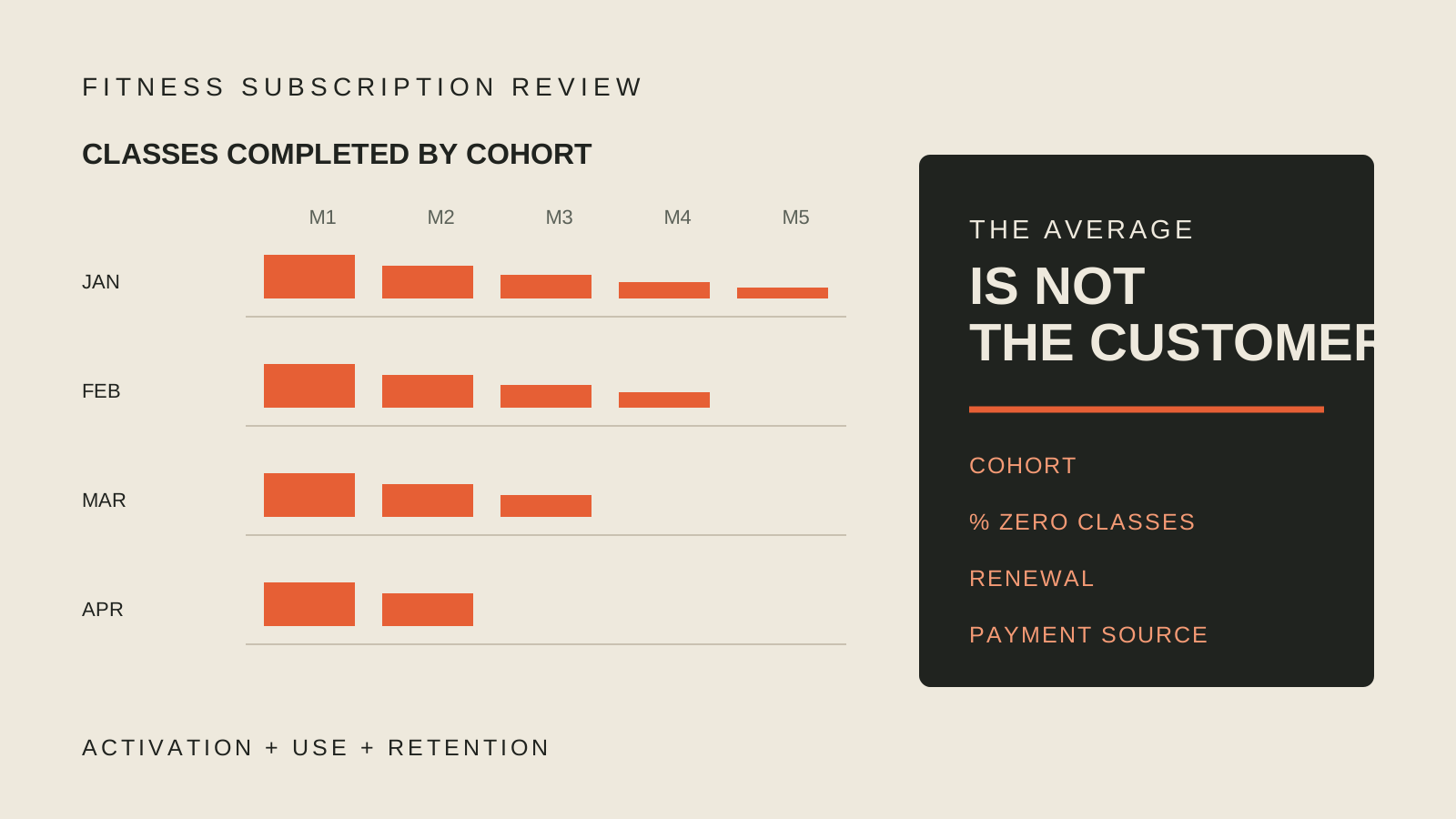
The chart looked clean. I still would not write a check based on it.
A friend sent me churn data from a fitness subscription company and asked what I thought. My short answer was that I did not think the chart meant much.
That does not mean the business is bad. It means the chart does not answer the important questions.
A subscription can still be active while the customer has stopped using the product. In fitness, that gap matters a lot. Somebody can pay for months after the habit is gone. One reminder from an app store about an old subscription can suddenly move the cancellation numbers. The revenue looked stable right up until the inactive customers remembered it was there.
I have lived through this more than once at Aaptiv and elsewhere.
I would start with monthly cohorts. Put every customer in the month they joined, then follow that group forward. How many classes did they complete in month one, month two, and month three? What percentage renewed? How many completed zero classes?
The zero matters because averages will not work in fitness. A small number of people can take a huge number of classes and pull the average up while most of the cohort slowly disappears. The average member might look active even when there is no actual member behaving like the average.
I also want to see activation. Did a new customer complete a first class? How quickly did use taper after that? Did the January cohort behave differently from the May cohort? That tells me whether the product is improving, whether seasonality is doing the work, or whether a big acquisition channel brought in people who never formed a habit.
Then split it again. Show the cohorts by workout category, by people who use multiple categories, and by payment source. A web subscriber and an app-store subscriber can have different economics and different cancellation behavior. Combining them makes the chart smoother and the decision worse.
The best answer is the raw data. Give me a table of classes completed by customer and month, another table with subscription status, and a third with payment source. I can build the view from there and test the assumptions instead of debating one finished chart.
This is less tidy than asking for churn. It is also much closer to the business.
The subscription tells me that somebody is still paying.
The cohort tells me whether the product is working.