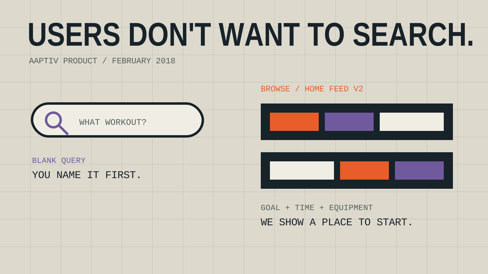
Aaptiv did not have a search box.
That absence had reached a friend at Constructor.io through the startup-investor grapevine. He sent me an email with the subject “search!” and asked the obvious question: had we thought about adding one?
My first reaction was a laugh.
“Ha! Yeah we dont, but mostly because users don't want to ‘search’ they want to browse but we should talk about the opportunity regardless!”
The punctuation was doing a lot of work there. I had a point of view, but I was not pretending the decision was finished.
Search made immediate sense if somebody arrived knowing exactly what they wanted. Type a trainer's name. Type treadmill intervals. Type twenty-minute strength workout. Get a result and start moving.
A lot of people did not arrive with a query that clean.
They had a goal, a block of time, some equipment, and an uncertain level of motivation. They might know they wanted to run, but not which workout. They might want to get stronger without knowing the name of a class. A blank field would make them invent the language for our catalog before we helped them understand it.
I thought the better first experience was browsing.
The product work happening that week reflected that choice. The backend team was building a second version of the home-feed API. Instead of returning one fixed list, it supported sections, layouts, feed items, user-specific items, and dynamic categories. The iOS work made those sections scroll horizontally while the screen itself moved vertically.
That sounds like implementation detail. It was also the product strategy made visible. Put useful groups of workouts in front of people. Let them scan. Give each row enough context to make the next choice feel small.
The onboarding work was trying to make the feed smarter before a member even reached it.
Both mobile teams were building questionnaire flows that allowed multiple answers. People could move backward and forward, change an answer, and wait through a results screen while the app assembled what came next. The implementation was still going through review on iOS and Android. Old recommendation code was being removed as the new flow took its place.
We were asking people questions because the app needed help interpreting intent. What are you trying to do? What do you like? What can you realistically fit into the week? A set of answers could give the home feed something better than a blank starting point.
None of that proved search was unnecessary.
My friend pushed back immediately. Constructor.io saw search usage increase when the experience was actually good. People who appeared not to want search might simply have learned that most search boxes were disappointing. Give them relevant results and behavior could change.
That was a fair challenge. It was also why my reply ended with “we should talk.”
The real question was not whether Aaptiv could put a text field at the top of a screen. We could. The question was where it belonged in the way members chose a workout, and whether it would solve a problem that browsing and guided recommendations were already trying to solve.
Adding search would also create another product surface to operate. Results needed ranking. The vocabulary members used had to connect to the way workouts were tagged. Empty results needed an answer. A technically functional search box could still make the catalog feel smaller or harder to understand.
My friend asked to set up a call and offered to bring his sales lead. I was happy to keep the conversation going.
The home feed was still moving through code review. The onboarding flow was still shedding old code. The search box was still absent. We had a conversation to schedule.